


HTCO AUSTRALIA PTY LTD
8/42 Hub Crescent,
Heathwood QLD
info@htco.com.au
0423 083 787

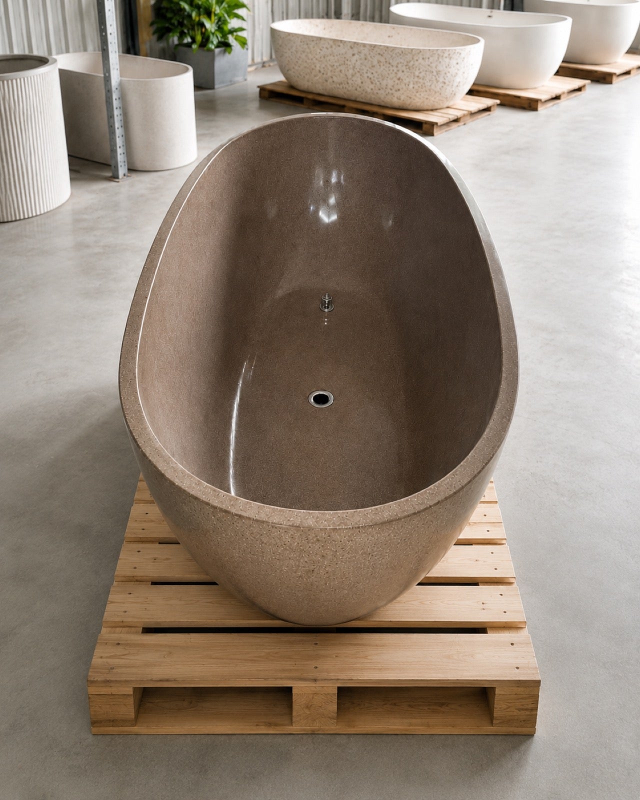
Choosing a terrazzo colour is not like choosing a paint chip. A swatch is a living scatter of glass and stone, and the same colourway can read warm in a north-facing kitchen and cool under a skylight. Here is how we help customers read the HTCO palette and land on a colour they will still love in ten years.
Every colourway has two layers: the base — the tone of the concrete matrix — and the aggregate — the chips of glass, marble and mineral suspended in it. Squint at a sample and you will see the base first; that is the colour your eye settles on from across the room. Step closer and the aggregate takes over, adding the sparkle and movement. A busy aggregate on a quiet base is forgiving and timeless; a bold aggregate on a bold base makes a statement piece.
Our core collection spans ten colourways, from near-neutral to celebratory:
The best colourway is the one that looks right at 7am and 7pm. Always judge a sample in the actual light of the actual room.
Screens flatten terrazzo. Before you commit, put a physical sample where the piece will live and look at it across a full day — morning light, midday, and lamplight. Warm colourways (Sunbaked Stone, Vanilla Sprinkle) glow under evening light and can feel heavy under cool daylight; cooler colourways (Pale Lagoon, Coal Stone) stay crisp in bright rooms but need warm artificial light to avoid looking clinical.
A few reliable rules from our showroom:
Not sure? That is what samples are for. Order a sample set and we will send a hand-cast chip of any colourway in the range. And if none of the ten is quite right, remember every HTCO colourway can be tuned to order — see our custom manufacturing story.
HTCO AUSTRALIA PTY LTD
8/42 Hub Crescent,
Heathwood QLD
info@htco.com.au
0423 083 787